The round that should have killed it
The third feedback round came in on a Tuesday with seventeen comments attached. Most of them were contradictory. The client wanted it to feel warmer but also more professional. They wanted the typography to be bolder but also quieter. They flagged the color palette as too aggressive and then asked for more energy. You made the changes anyway, because that is the job and when you sent the revised file you already knew it was not as good as what you had sent before.
What the weaker version did differently
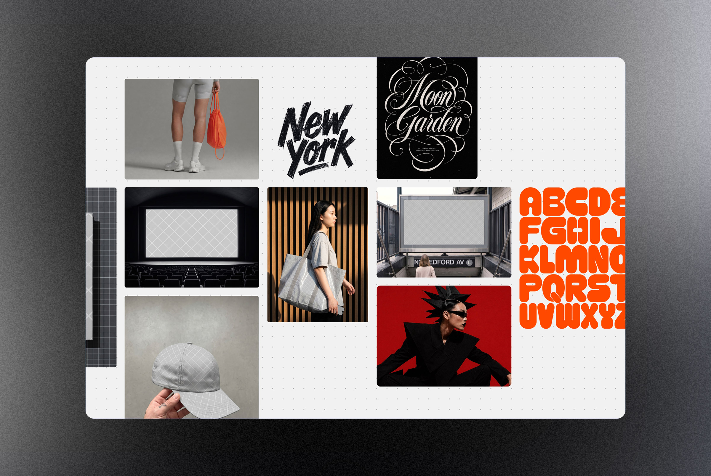
The revised design was softer. Some of the tension that made the original interesting had been smoothed away. The hierarchy was less decisive. The color choices were safer. By most of the measures you use to evaluate your own work, it had moved in the wrong direction. But something else had happened too. The design had become easier to read quickly. It asked less of the viewer. It did not require anyone to sit with it before forming an opinion. That accessibility, which felt like a concession during the revision process, turned out to be exactly what moved the project forward.
The friction that was protecting something interesting had been removed and what was left functioned well as a commercial object even if it no longer functioned as something worth keeping.
Legibility is not always a design virtue
There is a version of legibility that belongs in design discourse as a genuine value. Clear hierarchy, readable type, purposeful contrast: these things serve the audience and that matters. But there is another kind of legibility that has nothing to do with craft. It is the legibility of the familiar, the unthreatening, the design that does not ask anyone to adjust their expectations before they can appreciate it. When a revision produces that second kind, you feel it immediately. The work has become easier to move through a room. Stakeholders stop hesitating. Approvals arrive faster. The friction that was protecting something interesting has been removed and what is left is something that functions well as a commercial object even if it no longer functions as a piece of design you would put in a portfolio.

When you can feel the distance between the version that was better and the version that succeeded, that feeling is information worth keeping.
Sitting with the contradiction
The tension here is real and it does not resolve cleanly. A design that sells is not automatically a bad design. A design that earns approval is not automatically a compromise. But when you can feel the distance between the version that was better and the version that succeeded, that feeling is information worth keeping. It tells you something about the room the work had to live in. It tells you something about what your client actually needed versus what the brief said they wanted. Most usefully, it tells you something about where your own instincts are calibrated versus where the project actually needed to land.