A logo on a white background is a logo without a life
Every designer has sent a logo presentation where the mark sits dead center on a white slide, perfectly isolated, technically correct and completely unconvincing. The client squints. They say something like "I think I like it" in a tone that means they have no idea what they are looking at. That is not a taste problem on their end. It is a context problem on yours. A logo stripped of environment has no weight, no scale, no relationship to anything a human being actually touches or sees. It is a shape floating in a void and the brain does not know what to do with a shape floating in a void.
Placement does the work that explanation never can
When you drop a logo onto a coffee cup, a tote bag, or the side of a building, something shifts immediately. The mark stops being a graphic file and starts being a thing that exists. Scale becomes readable. Proportion makes sense. The client stops evaluating the logo as an object and starts feeling it as part of their world. That feeling is worth more than any rationale you could write in a brief.
A logo stripped of environment has no weight, no scale, no relationship to anything a human being actually touches or sees.
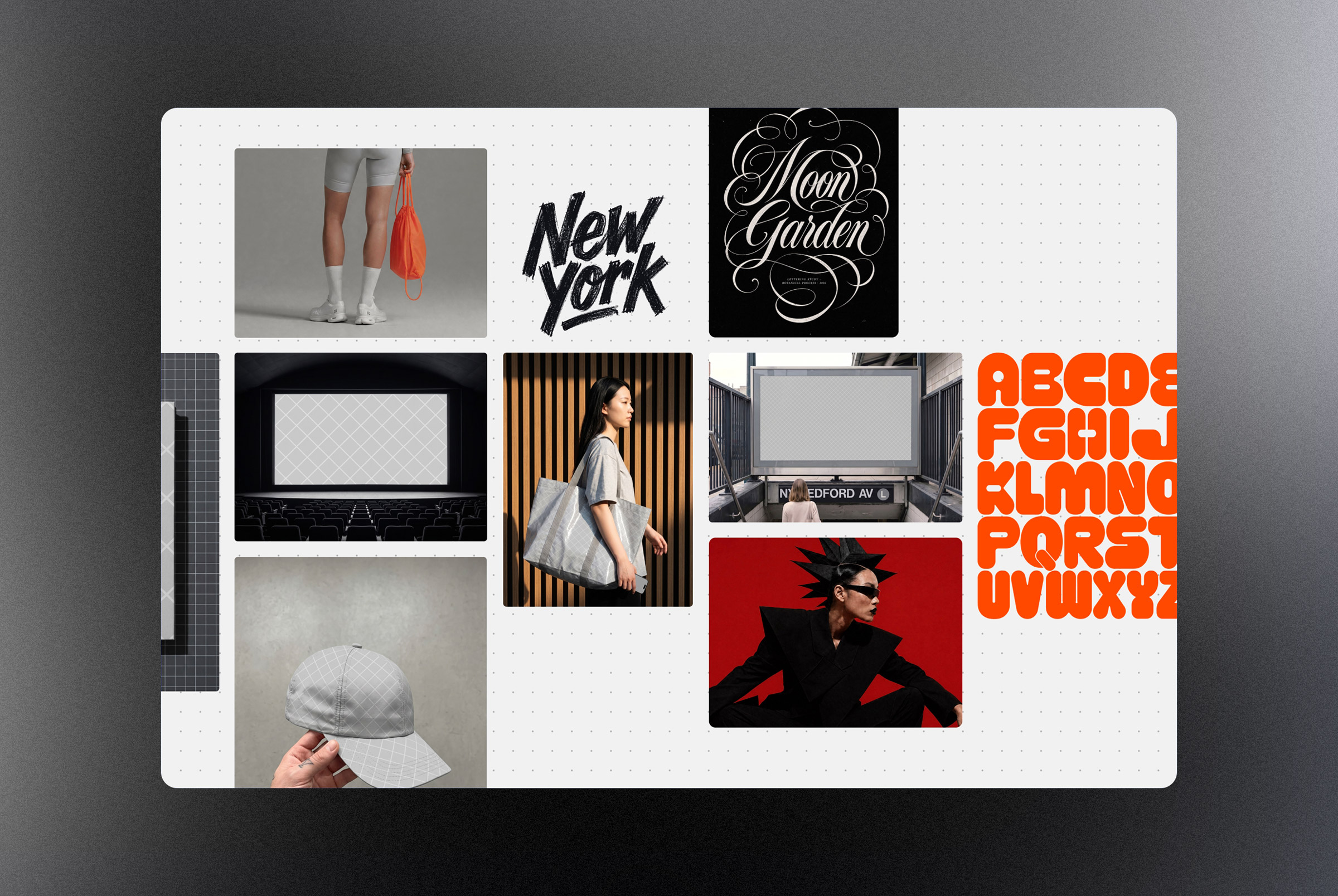
The environment you choose sends its own message
Mockup selection is not neutral. A logo placed on a kraft paper bag reads differently than the same logo placed on a frosted glass door or a black embossed business card. Each surface carries its own associations and those associations attach themselves to the brand before anyone reads a single word. A rustic linen texture suggests something handmade and considered. A clean aluminum panel suggests precision and scale. Glossy packaging suggests consumer confidence. When you choose a presentation environment carelessly, you are accidentally telling a story about the brand that you never intended to tell. The mockup is not just a display tool. It is part of the argument you are making about what this logo means and where it belongs. Choosing the right one requires the same thinking you put into the logo itself.
Mockup selection is not neutral. The surface you choose carries its own associations and those associations attach themselves to the brand before anyone reads a single word.
Imperfection in the scene builds believability

Perfectly lit, perfectly symmetrical, zero-shadow mockups can actually work against you. They read as sterile. Real objects catch light at odd angles, sit on surfaces with slight texture and exist in spaces that have depth. Scenes with a little grain, a little shadow, or a slight environmental imperfection feel inhabited. That sense of inhabitation is exactly what makes a logo feel like it was always meant to be there rather than dropped in from a design file at the last minute.